Pair trading in fixed income is not popular, at least not on #fintwit. We will try to shed some light on this strategy with an example that we like.
But let’s start with a brief explanation of what exactly is pair trading.
In its simplest form it means buying symbol A vs shorting symbol B and holding for the spread between the two to narrow. Here comes the tough part – the spread can be measured in multiple ways and at times a different ratio of long vs short is required.
What are the benefits of pair trading:
- You avoid directional risk. The general idea is that the short position offsets decline in the general market while the long position offsets rise in the market. You essentially trade the outperformance of product A vs product B.
- You can initiate pair trades in volatile markets without worrying too much about market volatility. (If you have selected the correct instruments) In fact, volatile markets present some of the best opportunities for this trading strategy.
What are the drawdowns of pair trading:
- You need a lot of capital. You need 2x more capital compared to directional trading. Going naked long worth $100 000 is different from going long $100 000 and shorting another $100 000.
- It costs more to hold a pair trade (called cost of carry) than a single position due to two main reasons:
You pay borrow fees on the short leg increasing your overall carry. Borrow fees may be expensive especially in less liquid instruments.
Due to the inherent need for leverage in this pattern you also need to pay interest on the margin you use (but only if you use any)
The exact notional amount of the short leg varies depending on the type of product, volatility of the product or the duration of the product. This brings additional complexity when in deciphering the ratio charts or performance of particular pair. That is why having an appropriate charting tools/scanning tools is essential to finding the gems in the dirt.
A pair trade can be expressed in multiple ways:
ETF A vs ETF B
Same issuer corporate bond A vs corporate bond B
Same sector but different issuers – corporate bond issuer A long vs corporate bond issuer B short
Corporate bond A vs benchmark ETF (i.e., $LQD $HYG)
Preferred Stock A vs benchmark ETF (i.e., $PFF $PGX $VRP $FPE)
Same issuer preferred stock A vs preferred stock B
Same sector but different issuers – preferred stock A long vs preferred stock B short
Same issuer – exchange traded preferred stock A long vs OTC traded preferred stock B.
In today’s example we will discuss an exchange traded preferred vs OTC traded preferred stock
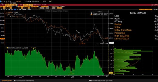
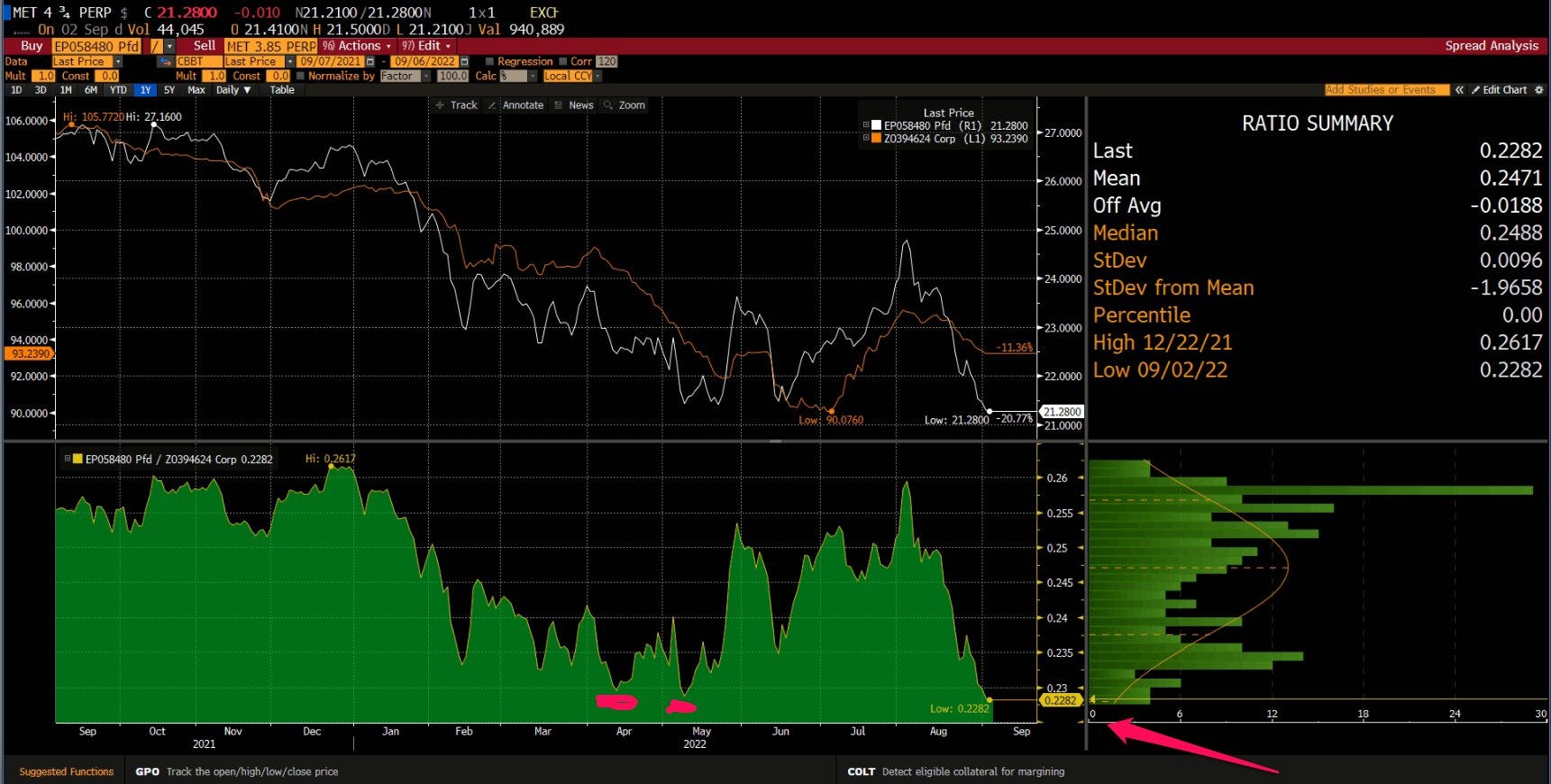
The trade is $MET-F vs MET 3.85% perpetual preferred stock (first symbol is always long, second symbol short). This is a same issuer but exchange traded preferred stock vs OTC traded preferred stock. I like same issuer trades because I protect myself from idiosyncratic shocks to the company. If something goes very wrong both products will suffer and the short position should offset the losses in the long position. For the sake of simplicity, we have chosen a pair requiring a 1:1 ratio, meaning buying and selling the same notional amount. This is what the standardized price spread chart (we assume the $25 par exchange traded preferred stock was issued at 100 to correspond to the price of the OTC issued perpetual preferred stock) and ratio chart looks like:
What I look for in the above charts:
Is the ratio chart at an important level
The standardized price spread chart to be at the same important level.
What may be the possible reason for this pair trade to be trading at these levels:
Exchange traded preferred stocks are significantly quicker to react to positive/negative market action
OTC traded products are primarily accessed by institutional traders where exchange traded products are also traded by retail traders
Exchange traded preferred stocks are generally less liquid than OTC traded products and can be moved with significantly less size. This makes OTC products slower to react when there is increased market volatility.
Cost of carry relatively high - the short position has a borrow fee of around 5% and on top of it you need to pay the 3.85% pa on a daily basis. Additionally, if you use leverage you need to pay interest on your long position too. This adds up if you need to hold the position for a longer time period. The costs add up and might be the reason why traders are not yet onto this trade.
Potential trade management:
First profit target at 0.24 on the ratio chart with a potential stop at 0.2230. 0.25 is the final profit target level.
Should the ratio spread move lower BUT you don’t want to exit the trade as you see value, you can add to your short leg more size as you already know it is the one that needs time to react. This applies to both directions, not just to the downside.
Potential risks:
The biggest risk comes from the fixed coupon component of the long (MET-F) vs potentially floating coupon on the short position. With rates going higher this may prove to be an issue.
Liquidity on the long position - exchange traded preferred stocks generally suffer from lack of liquidity and getting in and out requires additional slippage. For that reason one should be careful not to over pay on the ratio chart as you need to add the slippage costs on top of the carry costs.
If we break the lows in PGX/PFF the exchange traded preferred will be the first to drop leading to a loss. You should always remember that the exchange traded product is quicker to react to market stress.


